Forums / Maintenance / Suggest Ideas

6,920 total conversations in 569 threads

+ New Thread


Recent User Interface Changes

Last posted Feb 04, 2021 at 07:22AM EST. Added Dec 17, 2020 at 11:56AM EST
199 posts from 94 users

We noticed that there have been numerous comments about new UI in the comments section of entries. In a an attempt to enforce the 'keep in relevant rule' without appearing to silence opinions, and simultaneously collecting these opinions in a place where staff is more likely to see it, this thread was created.

Please try to keep them to this thread and not in the comments section of articles. Try to stay relatively constructive, but do express negative opinions. Comments on an entry that are not about the entry violate the 'keep it relevant rule'. However, we understand the frustration and we don't want to make it worse by warning those who have done so already.

Other notes:

  • Gentle reminder that mods do not, never have, and almost certainly never will have control over the functioning of the site. This is entirely the realm of the staff.
  • Mods largely were unaware of what exactly these changes woul entail or when they would happen outside of vauge 'improvements coming soon'.
  • Most mods that have so far expressed opinions are not particularly fond of the changes other than hope it would possibly prevent ads from being laid over the actual articles.
  • Personal immediate suggestion is the ability for users with accounts to be able to go back to the old view.
Last edited Jan 14, 2021 at 09:18AM EST

I have irl things at the moment, but in just trying to create a comment to direct users to this tread on mobile:

I cannot read everything that I have written before posting. There is no ability to scroll side to side by touch. More importantly about posting… how am I supposed to post? I was able to add a string of characters so the space I was typing autoscrolled over to the point I could see the 'add commen' button, and thankfully deleting them did not lose this. However, the fact that this needs to be done at all is very concerning. In addition, my hopes about the advertising were false, with ads repeatedly covering up the the comment box while I was typing. While this would go away after a few seconds, new ones would pop up and do the same thing not long after.

I'm not particularly fond of the new look, but this is a change that makes using the site's features antagonistic to users actually trying utilize them.


Edit:

PrivateerMan wrote:

If the Staff are not very likely to see the complaints in the articles, are they more likely to see complaints here?

Staff are infinitely more likely to see problems that are brought up in the maintenance board which was created with the explicit purpose of addressing site problems, of which the actual workings of the site itself is something only they can address, than comment sections on entries.

Last edited Dec 17, 2020 at 12:42PM EST

The collapsible sections are nice. Don't care for the double spacing. Makes it feel like a student paper. More condensed blocks of text gives it a more authoritative, encyclopedia-like feel.

Everything's just too wide and all over the place and fading into the background – hard to see right away, I need to search it. Worse, I keep overshooting to the comments section: previously I'd stop right at the start of the comments simply by pressing End, but now it takes me all the way past.

It took me years to get used to the layout when you last changed it, and I still don't like it as much as I liked the old one. This looks to be much the same, only worse. Please change it back.

This is some Deviantart eclipse shit, change for the sake of change and wholly inferior. The spacing is too wide, the format is weird and last but not least, no one wanted this.

Please change it back.

This post has been hidden due to low karma.
Click here to show this post.

Firock wrote:

This is some Deviantart eclipse shit, change for the sake of change and wholly inferior. The spacing is too wide, the format is weird and last but not least, no one wanted this.

Please change it back.

Gentle reminder that mods do not, never have, and almost certainly never will have control over the functioning of the site. This is entirely the realm of the staff.

While I'm here, I'd also like to add in I saw this response coming.

Last edited Dec 17, 2020 at 01:13PM EST

3kole5 wrote:

Gentle reminder that mods do not, never have, and almost certainly never will have control over the functioning of the site. This is entirely the realm of the staff.

While I'm here, I'd also like to add in I saw this response coming.

Where did he ever mention the mods, anyway? You just assumed it was directed to the mods, when in reality it would only make sense to assume it would be directed to whoever actually is responsible for these things.

Kindly forward our complaints to the staff.

I greatly prefer the "original" KYM layout to this new one. The original layout feels like a proper database/wiki, with reasonably readable information (ads aside), while this new layout has way too much white space in the actual text itself and feels more like a site of clickbait listicles. And that's not even going into the load times being much greater than the old layout and the infinite editorial recommendations that remind me too well of those Taboola modules.

I feel like web page design should be "If it ain't broke don't fix it", there really wasn't an explicit need for this level of overhaul when there are areas that could be fixed (such as the vote timer).

Also I think it's pretty bullshit that moderators aren't made aware of site layout changes like this in advance, you'd think that mods should be given some notice of how site layout changes are going to be rolled out so they can help manage community response but no

These are just test pages we are rolling out but will be doing lots of tweaks.

Thanks for the feedback. Keep it coming. I'm compiling all the feedback together for this and will be addressing as much as possible.

In regards to mod communication, I did share screenshots of the design changes that would be tested with the mod team in advance. However, the mod team holds no responsibility for this and should not be given any grief over it.

Lastly, I want to stress that these test pages are not final layouts by any means. They will not be rolled out site wide until they've been thoroughly tested and finalized.

Last edited Dec 17, 2020 at 02:54PM EST

How many times has this happened on KYM by now..? As many times as it was widely disliked by everyone, I know that much.

Like someone said on the US Elections entry, just how hard could it possibly be for Staff to simply poll people about these things first..? That is like base-level user feedback gathering taught at the first year of business management in college. There is zero excuse to somehow not be able to know the obvious negative response to these updates before designing them, let alone implementing them, which also saves you time and money by not doing them at all.

I read someone before saying that the KYM userbase was completely secondary and unnecesary to the site's purpose, but damn, you guys really take that idea to its most literal extreme possible, huh. Acknowledging that we exist for something other than nagging us about site rules (again) would not hurt your income, you know.

Anyway, just keep the old format. Judging by Jill's comment, this did not make mobile visibility better and I know these changes are mainly driven by wanting to make mobile browsing better, so there is no reason to keep the new look at all and, as stated by others, not a single person here dislikes the way the site has looked for years now, so stop trying to fix what is not broken. It will just drive newcomers away after they are welcomed with such an eye-hurting, cluttered mess of a layout.

Last edited Dec 17, 2020 at 01:54PM EST

Don wrote:

These are just test pages we are rolling out but will be doing lots of tweaks.

Thanks for the feedback. Keep it coming. I'm compiling all the feedback together for this and will be addressing as much as possible.

In regards to mod communication, I did share screenshots of the design changes that would be tested with the mod team in advance. However, the mod team holds no responsibility for this and should not be given any grief over it.

Lastly, I want to stress that these test pages are not final layouts by any means. They will not be rolled out site wide until they've been thoroughly tested and finalized.

But why tho?

Why change something that's not broken like the UI when there is the stuff that's broken and hasn't been changed for years. Like the voting timer and the edit bottom.

TL:DR don't pls

The old site was nice and compact, and took advantage of the fact that screens are usually wide instead of tall. The article was front and center, and things that were not the article were placed off to the side and in the margins. The images were of consistent size, because the first and the latest image in any particular gallery are of equal importance. The editorials were off in their own little place because we didn't care, and the latest images were always at the bottom and packed full because we really cared. The old site worked well for desktops, and only required a few tweaks to make it more modern.

Now, the site is just scrollapalooza. Everything is inline, and the things that you'd expect to see on the sides is now competing with the article itself for screen-space. Not only that, but the competition is fierce, and everything is competing by trying to take up more vertical space than everything else. The images are of inconsistent sizes just to take up more vertical space. The entries are of all differing sizes to take up more vertical space. The text itself is double spaced, putting less information on the screen at any one time and taking up – you guessed it – more vertical space. The comments are even getting into the game, embarking in a social distancing of their own. Worst of all, the best part of the site – the latest images section below every article, where I not only see a ton of what the internet has cooked up, but also new memes and formats – has been replaced by singlular examples and editorials, designed to take up MORE VERTICAL SPACE. This may be a boon to mobile users, but as someone who has a screen that's wide rather than tall, it makes the site unreadable.

I don't want to dart my eyes back and forth like a typewriter and have to scroll down three times to see the end of a paragraph. I don't want to have to go past important things like the header. I want to see what the KYM userbase has coughed up, not just the staff's clickbait titles. This site is one of the last I frequent that's ideal for desktop users, and this redesign takes that away from me.

Put stuff on the side of the page, for christ's sake. The summary of the article, for instance, or the related entries, or the sub-entries – these are IDEAL for putting to the side, as it allows you to go to related memes quickly and easily. Compress the UI down, too, so that you can see lots of text at the same time – and for the love of god, keep the large number of latest/trending images at the bottom of the page! Maybe put bands of your clickbait editorials at regular intervals, like you do with bands of ads between 'pages' now, but don't take that away completely!

It also has the same problem with many news sites have in terms of comments: It's unintuitive where these begun. Also, like at the moment, the use of whitespace is poor. Would be nice if the whitespace and the space with text had a slightly different shade of color or even better: had a frame separating whitespace from space with stuff.

Ten Shadows wrote:

Where did he ever mention the mods, anyway? You just assumed it was directed to the mods, when in reality it would only make sense to assume it would be directed to whoever actually is responsible for these things.

Kindly forward our complaints to the staff.

Considering how often we've been railed on in the past for things that were completely out of our control, I don't think it was an unfair assumption to make – especially considering there are comments pinning this particular case on the mods in the entry in question. Most of us feel the exact same way about the redesign; a little understanding would be appreciated. We understand it's not always made obvious who controls what (outside of the pertinent forum threads), so we like to clear this up whenever we can.

Please be patient while we gather user input, after which we will happily begin forwarding it to the manager… I mean, the staff.

I understand why some of you wouldn't like the new UI as it currently is. It just came out, and it's still a work in progress. Just as Don the man himself put it, the final product is not done yet, which is why we need your honest feedback on how the new UI could be improved. You may be hating the change because you're moving from something old yet functional, to something new yet still in beta phase.
Being, among other things, an entry moderator, it matters to me to make sure that entries are easy to edit and more importantly well-presented for front-end users.
The mod team will always serve to be the connection between the site's userbase and the staff members who are working on this site because it's their job. So I ask that whatever feedback you have to give, you give in a respectful manner for the people making this site exist in the first place.

Nedhitis wrote:

How many times has this happened on KYM by now..? As many times as it was widely disliked by everyone, I know that much.

Like someone said on the US Elections entry, just how hard could it possibly be for Staff to simply poll people about these things first..? That is like base-level user feedback gathering taught at the first year of business management in college. There is zero excuse to somehow not be able to know the obvious negative response to these updates before designing them, let alone implementing them, which also saves you time and money by not doing them at all.

I read someone before saying that the KYM userbase was completely secondary and unnecesary to the site's purpose, but damn, you guys really take that idea to its most literal extreme possible, huh. Acknowledging that we exist for something other than nagging us about site rules (again) would not hurt your income, you know.

Anyway, just keep the old format. Judging by Jill's comment, this did not make mobile visibility better and I know these changes are mainly driven by wanting to make mobile browsing better, so there is no reason to keep the new look at all and, as stated by others, not a single person here dislikes the way the site has looked for years now, so stop trying to fix what is not broken. It will just drive newcomers away after they are welcomed with such an eye-hurting, cluttered mess of a layout.

AMEN!

Whilst this may not be about the redesign, I feel this is relevant. Before modernizing the site's UI, KYM should add quality of life features other sites have had for years. Changeable votes, editable comments, and a black-list for tags and memes are lacking, whilst most sites have those features.

Commodore V wrote:

Whilst this may not be about the redesign, I feel this is relevant. Before modernizing the site's UI, KYM should add quality of life features other sites have had for years. Changeable votes, editable comments, and a black-list for tags and memes are lacking, whilst most sites have those features.

KYM's the Star Citizen of sites, why fix something when you can keep adding more and more shit?

Like, let me emphasize everyone's point here, no one wants a new UI, no one, none, ninguem, so why change it? It's fine as it is so why change a tried and tested UI for a horrible beta that will probably look worse anyway?

David Bowie (The Sovereign) wrote:

Don't keep breaking shit staff. I know it's only on the election page for testing so far, but please don't.

It does actually seem to be on some other pages as well, such as the Piper Perri Surrounded page. I only know that because I happened to check it because I wanted to link someone to it to explain a meme.

As for sone actual criticism. Too much space, adds everywhere, it's hard to read or even use it on moblile, commenting is a pain, finding the comments is a pain and finally it looks too much like generic news site garbage. It has no soul basically.

Going to have to echo the "don't change something that works just fine" sentiment.

I don't want a different UI. I like how it is now. The problem with this site has never been the UI, just certain features like voting and the lack of an edit button.

If this goes through, I hope we'll at least have the option of using the current one.

I know everyone has their own complaints but the one thing I Really don't like is that the main entry & galleries are left justified, but the related entries, editorials, tags/entry info, and comments are centered on the page. It looks really inconsistent and janky when you eventually get down to the bottom.
Also the thumb you hover over to show the score ratio on comments is invisible, so that's messing with me.

I really would like to hear an answer to the question I've heard asked several times by now (myself included): why the change? What did you wish to accomplish with this? Is it really just to serve the mobile, even to the detriment of home computers, as several people have speculated? Is it to serve the purpose of ads and making more money? It's definitely not because of the users, or you would have asked us first and by now would have mothballed the whole idea.

Be open. Be candid. Be something that so very few websites actually are. Tell us why.

Most of my issues have already been brought up, so I'll just say this: I prefer the old layout's square profile pictures. By cutting them into a circle, some detail is lost and it becomes trickier to distinguish between two similar ones at a glance (especially when the owners have their comments right after each other).

Imaynotbehere4long wrote:

Most of my issues have already been brought up, so I'll just say this: I prefer the old layout's square profile pictures. By cutting them into a circle, some detail is lost and it becomes trickier to distinguish between two similar ones at a glance (especially when the owners have their comments right after each other).

Can I just say how much I despise that every site is obsessed with having circular profile pictures?

I like squares. They're perfectly utilitarian and tessellate-able. Don't get rid of them, embrace them.

Commodore V wrote:

Whilst this may not be about the redesign, I feel this is relevant. Before modernizing the site's UI, KYM should add quality of life features other sites have had for years. Changeable votes, editable comments, and a black-list for tags and memes are lacking, whilst most sites have those features.

This site is 12 years old and tons of people have complained about the lack of these features. If they haven't added those features already, I doubt they ever will.

Talkie Toaster wrote:

Can I just say how much I despise that every site is obsessed with having circular profile pictures?

I like squares. They're perfectly utilitarian and tessellate-able. Don't get rid of them, embrace them.

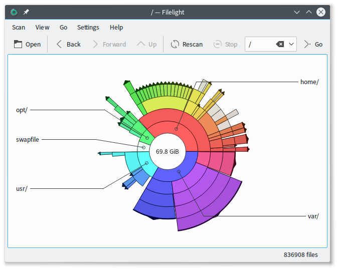
Let's say, hypothetically, that there was to be a circle-oriented graphical system with circular pixels and Circular Coordinates and it looked something like Filelight:

In that case, the usage of a circular profile picture could be justified, I think.

It would be much more constructive if whoever manages the website's code attacked the month-old bugs that were already mentioned elsewhere: the galleries which randomly won't load more than a page at a time, the replies that send you back to the frontpage, and so on. Unless the building of the new UI is directly linked to those bugs, in which case: please don't bother about the new UI. Really. At all.

Not sure if this is a bug or has been mentioned already, but the My Little PogChamp entry also has this layout now. I'm pretty sure it didn't have that 3 days ago. I hope that's not intentional. I think DA did something similar where they made Eclipse more and more prevalent until the full implementation.

xoxin wrote:

Not sure if this is a bug or has been mentioned already, but the My Little PogChamp entry also has this layout now. I'm pretty sure it didn't have that 3 days ago. I hope that's not intentional. I think DA did something similar where they made Eclipse more and more prevalent until the full implementation.

It feels like they are "easing us into it", except it gets more and more irritating instead

TerribleTrike wrote:

It feels like they are "easing us into it", except it gets more and more irritating instead

I hope they listen for once and decide to just scrap it already, no one wants it and it makes mobile even worse instead of better like they hoped.

I would like to place a formal request to have whoever thought that this New Interface was a good idea in the first place have their driver's license forcefully changed to reflect their new status as an organ donor and for them to immediately afterwards find themselves sandwiched between the bumpers of two fast-moving automobiles, they should then be taken to the hospital, pronounced braindead regardless of any evidence to the contrary and then have their eyeballs and optical nerves harvested and sent to me personally, as the new Interface is so bad that I am in now need of a Eyeball Transplantation.

Keep posts at least semi-constructive. A childish rant on how site staff members should be effectively killed is not contributing to actual discussion and goes against site rules

My head hurts from looking at it, All the buttons are generic blue text that blends in to the searing-white background and for God's sake, NO CIRCULAR PROFILE PICS! I didn't spend a couple hours of my life drawing a profile pic specifically to use on this site just so some idiot trendy web developer can crop it to Hell and back with their God-awful circular profile pics. Additionally, I'm inclined to feel that the developers were slightly self-aware of how absolute garbage this new Interface is because it makes the Forums harder to get to, probably because they know the only way people aren't going to rightfully scream at them about this is if they can't find the Forums.

But since I'm being constructive, how about:

-Edit buttons for comments.
-Optional Dark Mode.
-The ability to rescind Upvotes and Downvotes.
-The ability to filter out tags in the Search.
-Ads that don't render the website unusable without AdBlock and UBlock.

Don't fiddle with the UI at all until we get at least 3 of these, in fact, don't fiddle with the UI at all.

Sorry if I sound a little too royally pissed for a maintenance thread, but I genuinely felt like I was about to vomit upon seeing the new Interface. I still feel a little sick since seeing it about 30 minutes ago. Just get rid of it and give us literally anything in my short list above, the new Interface physically sickens and nauseates me.

Last edited Dec 23, 2020 at 11:59AM EST

Also, the "Recent images" thing does the same mistake as Last.fm did: Made some thumbnails larger than others, thus reducing the amount of stuff one can display on a page. Remember, this is not a newspaper! People come here for content.

Old interface:

12 images can be fit on "recent images". Recent images takes up 60% of the screen.

New interface

10 images can be fit on "recent images". Recent images takes up 85% of the screen.

That's one of the classic mistakes website makers do when redesigning a website. Perhaps it's because website designers think that a site that is made to advertise your product should be used as a template for community websites with user-submitted content?

Last edited Dec 24, 2020 at 06:01AM EST
Skeletor-sm

This thread is closed to new posts.

Old threads normally auto-close after 30 days of inactivity.

Why don't you start a new thread instead?

Yo! You must login or signup first!