This submission is currently being researched & evaluated!
You can help confirm this entry by contributing facts, media, and other evidence of notability and mutation.
| Navigation |
| About • Origin • Spread • Various Examples • Search Interest • External References • Recent Images |
About
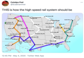
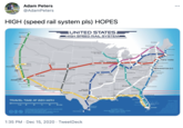
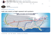
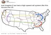
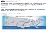
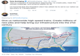
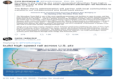
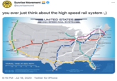
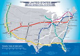
The United States High Speed Rail System Map is an illustration of a proposed high-speed train system for the United States. Beloved by many who support a more robust railway system in the United States, the image depicts several train lines that would run throughout the U.S. and reach speeds of 220 miles per hour. Many use the image to demand or express support for the system online.
Origin
On February 3rd, 2013, Alfred Twu published a map they illustrated of a proposed high-speed rail system that would run throughout the United States, including on the east coast, across the southwest, through the midwest and up the west coast (shown below).[1]

Spread
Following the publication of the map, numerous media outlets covered the design, with some supporting, criticizing and explaining the map.[2][3][4]
Several days later, on February 6th, 2013, Twu wrote about why they created the map. They wrote:
I created this US High Speed Rail Map as a composite of several proposed maps from 2009, when government agencies and advocacy groups were talking big about rebuilding America's train system.
Having worked on getting California's high-speed rail approved in the 2008 elections, I've long sung the economic and environmental benefits of fast trains.
This latest map comes more from the heart. It speaks more to bridging regional and urban-rural divides than about reducing airport congestion or even creating jobs, although it would likely do that as well.
Instead of detailing construction phases and service speeds, I took a little artistic license and chose colors and linked lines to celebrate America's many distinct but interwoven regional cultures.
The map retained cultural significance over the next few years. On September 6th, 2014, Twu launched a Kickstarter [5] project to create a board game out of the map.
In 2020, the map began going viral, again, on Twitter. On January 23rd, 2020, Twitter[7] user @thisiscaramore tweeted the image with the caption "I want her so fucking much." The tweet received more than 185,000 likes and 51,000 retweets in less than two years (shown below, left).
On May 3rd, 2020, Twitter[5] user @aamersnow tweeted the image with the caption, "I don't watch porn I just look at this and cry." The post received more than 112,000 likes and 16,000 retweets before being deleted (shown below, center).
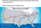
Later that year, Redditor [6] posted the map in the /r/shittyaskscience with the caption, "Boomers: All millennials want is avocado toast and communism." The map was used as an example of what "Millennials actually want." The post received more than 3,500 points (97% upvoted) and 135 comments in less than six months (shown below, right).


Various Examples


Search Interest
Not available.
External References
[1] California Rail Map – United States High Speed Rail System
[2] Business Insider – Here's What An American High Speed Rail Network Could Look Like
[3] Mashable – Map Shows Where 220mph Trains Would Go in the U.S.
[4] Business Insider – Why Covering The US In High-Speed Rail Makes No Sense At All
[5] Kickstarter – High speed rail game
[6] Reddit – /r/PresidentialRaceMemes
[7] Twitter – @thisiscaramore's Tweet
Recent Videos
There are no videos currently available.
Recent Images 12 total
Share Pin
Recent Images 12 total
Recent Videos 0 total
There are no recent videos.



Comments ( 73 )
Sorry, but you must activate your account to post a comment.
Please check your email for your activation code.