Data Visualization
This submission is currently being researched & evaluated!
You can help confirm this entry by contributing facts, media, and other evidence of notability and mutation.
About
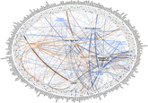
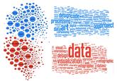
Data Visualization refers to the practice of using images, diagrams and schematics to represent data and information. Its application in the branch of descriptive statistics dates back to the 17th century. On the Internet, data visualization is most prominently featured in infographics and flowcharts.
History
According to Milestones in the History of Data Visualization: A Case Study in Statistical Historiography:
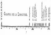
In 1644, Michael Florent Van Langren, a Flemmish astronomer, is believed to have provided the first visual representation of statistical data. The one dimensional line graph below shows the twelve known estimates at the time of the difference in longitude between Toledo and Rome as well as the name of each astronomer who provided the estimate. What is notable here is that while Van Langren could have provided this information in a table, it is the use of the graph that really visually displays the wide variations in estimates.
Online Presence
On March 25th, 2008, the subreddit /r/visualization[6] was created for discussions related to information visualization and datasets. On January 5th, 2009, the /r/dataviz[5] subreddit was launched for "beautiful & informative representations of the abstract." That month, the data visualization news blog Datavisualization.ch[7] was created. In July 2010, data journalist David McCandless gave a TED Talk titled "the beauty of data visualization" (shown below).
In April 2011, the dataviz community platform Visual.ly[8] was launched, which allows users to create various types of data visualizations and infographics.
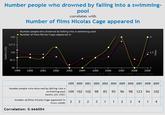
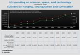
On February 14th, 2012, the /r/dataisbeautiful[2] subreddit was created for data visualization submissions and discussions. In 2014, statistician Tyler Vigen launched a blog[1] highlighting graphs showing high correlations between random, unrelated statistics (shown below).


On Xkcd
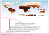
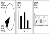
The webcomic Xkcd often incorporates various data visualizations in comics. On September 27th, 2010, the site[4] published a dot plot depicting the "frequency with which various adjectives are intensified with obscenities" (shown below).

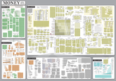
On November 21st, 2011, a data visualization featuring currency in dollars, thousands, millions and billions was posted on the site (shown below).[3]

Search Interest
External References
[1] Tyler Vigen – Suprious Correlations
[2] Reddit – /r/dataisbeautiful
[4] Xkcd – Adjectives
[5] Reddit – /r/dataviz
[6] Reddit – /r/visualization
[7] Datavisualization.ch – Data Visualization
[9] Datavis – Milestones in the history of thematic cartography, statistical graphics, and data visualization
[10] Dundas – A Brief History of Data Visualization
[11] DataArt – A Quick Illustrated History of Visualisation
[12] Springer – A Brief History of Data Visualization
[13] Perceptual Ledge – DATA VISUALIZATION
PAST, PRESENT, AND FUTURE
[14] Information Is Beautiful – "":http://www.informationisbeautiful.net/
[15] Flowing Data – "":http://flowingdata.com/
[16] Visualizing.org – Visualizing
[17] InfoAesthetics – Information Aesthetics
[18] Visual Complexity – Visual Complexity
[19] Chart Porn – Data Visualization You Just Gotta Love
[21] Gizmodo – The Best Data Visualization of 2013
[22] Tumblr – Tagged Results for Data Visualization
[23] Visual.ly – Data Visualization
[24] Daily Infographic – A New Infographic Every Day
[25] Tumblr – NYC Open Data



Top Comments
YorShadow
Jul 09, 2014 at 03:10PM EDT
Nigel the treasure hunter
Jul 06, 2014 at 12:57PM EDT