Hi! You must login or signup first!

Gmaillogo

Submission   8,368


About

2020 Gmail Logo Redesign refers to jokes mocking a new Gmail logo rolled out in October of 2020. The new logo was met with heavy criticism across social media platforms, with users complaining that the logo blends in with the rest of the new Google Workspace logos too much.

Origin

On October 6th, 2020, Google announced that it would replace the Gmail logo as part of a revamp to the Google G Suite of software,[1] which also includes changing the name of the suite to Google Workspace. The new logo was shown off in a video uploaded the same day to the Google Workspace YouTube channel, gaining over 234,000 views in 3 weeks (shown below).

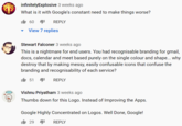
Viewers were immediately critical of the redesign in the comments section, complaining that the logo was too easy to confuse with all the others (example shown below, left and right). This became one of the leading complaints among users.

John Abraham 3 weeks ago I'm sorry, Google, but changing all of your app's icons to use all of the same colors makes it harder to quickly identify them on my home screen. It's easier to find colors quickly than it is to find shapes. It 557 REPLY View 18 replies Jeroen 3 weeks ago Let's all take a moment and honor those poor Support people that will have to guide users on which buttons to press. iL 336 REPLY View 7 replies gemsling 3 weeks ago Google sees uniformity. I see confusion. When all icons look almost the same, it's harder to instantly recognise an app by appearance.
infinitelyExplosive 3 weeks ago What is it with Google's constant need to make things worse? 60 REPLY View 7 replies Stewart Falconer 3 weeks ago This is a nightmare for end users. You had recognisable branding for gmail, docs, calendar and meet based purely on the single colour and shape... why destroy that by making messy, easily confusable icons that confuse the branding and recognisability of each service? It 51 REPLY Vishnu Priyatham 3 weeks ago Thumbs down for this Logo. Instead of Improving the Apps. Google Highly Concentrated on Logos. Well Done, Google! It 29 REPLY

Spread

As the logo was rolled out onto devices it was met with further criticism, including photoshops and memes as well as traditional text posts pointing out the issues with the logo. On October 17th, 2020, Twitter user Xploshi posted an image comparing the old G Suite logos to the new Workspace logos, captioned, "These updated google app logos are terrible."[2] (Shown below, left). The post gained over 123,000 likes and 11,000 retweets in 12 days. On October 25th, Twitter user killedbygoogle[3] uploaded a What The Hell Is This meme criticizing the redesign, gaining over 1,000 likes in 4 days (shown below, right).

Xploshi @Xploshi 000 These updated google app logos are terrible M 31 M 31
What the hell is this?

On October 29th, yahoo! news[4] published an article detailing the criticism toward the new logo.

Various Examples

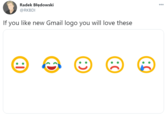
Radek Błędowski 000 @RKBDI If you like new Gmail logo you will love these :)
Buttigieg Dredd @DicconHyatt · Oct 27 My review of the new gmail logo 000 Gmail STINKS!
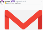
Garcanjo" C @Garcanjo5 · Oct 28 TM 000 Rest in Peace Gmail logo... M
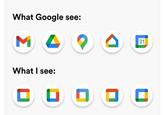
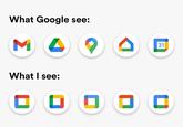
What Google see: 31 What I see:
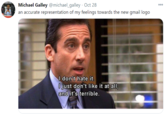
Michael Galley @michael_galley · Oct 28 an accurate representation of my feelings towards the new gmail logo 000 I don't hate it. O just don't like it at all, and it's terrible.
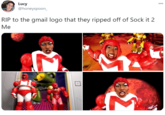
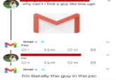
Lucy @honeyspoon_ 000 RIP to the gmail logo that they ripped off of Sock it 2 Ме

Search Interest

External References


Share Pin

Recent Images 12 total


Recent Videos 0 total

There are no recent videos.


Load 19 Comments
2020 Gmail Logo Redesign

2020 Gmail Logo Redesign

PROTIP: Press 'i' to view the image gallery, 'v' to view the video gallery, or 'r' to view a random entry.

This submission is currently being researched & evaluated!

You can help confirm this entry by contributing facts, media, and other evidence of notability and mutation.

About

2020 Gmail Logo Redesign refers to jokes mocking a new Gmail logo rolled out in October of 2020. The new logo was met with heavy criticism across social media platforms, with users complaining that the logo blends in with the rest of the new Google Workspace logos too much.

Origin

On October 6th, 2020, Google announced that it would replace the Gmail logo as part of a revamp to the Google G Suite of software,[1] which also includes changing the name of the suite to Google Workspace. The new logo was shown off in a video uploaded the same day to the Google Workspace YouTube channel, gaining over 234,000 views in 3 weeks (shown below).


Viewers were immediately critical of the redesign in the comments section, complaining that the logo was too easy to confuse with all the others (example shown below, left and right). This became one of the leading complaints among users.


John Abraham 3 weeks ago I'm sorry, Google, but changing all of your app's icons to use all of the same colors makes it harder to quickly identify them on my home screen. It's easier to find colors quickly than it is to find shapes. It 557 REPLY View 18 replies Jeroen 3 weeks ago Let's all take a moment and honor those poor Support people that will have to guide users on which buttons to press. iL 336 REPLY View 7 replies gemsling 3 weeks ago Google sees uniformity. I see confusion. When all icons look almost the same, it's harder to instantly recognise an app by appearance. infinitelyExplosive 3 weeks ago What is it with Google's constant need to make things worse? 60 REPLY View 7 replies Stewart Falconer 3 weeks ago This is a nightmare for end users. You had recognisable branding for gmail, docs, calendar and meet based purely on the single colour and shape... why destroy that by making messy, easily confusable icons that confuse the branding and recognisability of each service? It 51 REPLY Vishnu Priyatham 3 weeks ago Thumbs down for this Logo. Instead of Improving the Apps. Google Highly Concentrated on Logos. Well Done, Google! It 29 REPLY

Spread

As the logo was rolled out onto devices it was met with further criticism, including photoshops and memes as well as traditional text posts pointing out the issues with the logo. On October 17th, 2020, Twitter user Xploshi posted an image comparing the old G Suite logos to the new Workspace logos, captioned, "These updated google app logos are terrible."[2] (Shown below, left). The post gained over 123,000 likes and 11,000 retweets in 12 days. On October 25th, Twitter user killedbygoogle[3] uploaded a What The Hell Is This meme criticizing the redesign, gaining over 1,000 likes in 4 days (shown below, right).


Xploshi @Xploshi 000 These updated google app logos are terrible M 31 M 31 What the hell is this?

On October 29th, yahoo! news[4] published an article detailing the criticism toward the new logo.

Various Examples


Radek Błędowski 000 @RKBDI If you like new Gmail logo you will love these :) Buttigieg Dredd @DicconHyatt · Oct 27 My review of the new gmail logo 000 Gmail STINKS! Garcanjo" C @Garcanjo5 · Oct 28 TM 000 Rest in Peace Gmail logo... M What Google see: 31 What I see: Michael Galley @michael_galley · Oct 28 an accurate representation of my feelings towards the new gmail logo 000 I don't hate it. O just don't like it at all, and it's terrible. Lucy @honeyspoon_ 000 RIP to the gmail logo that they ripped off of Sock it 2 Ме

Search Interest

External References

Recent Videos

There are no videos currently available.
Recent Images 12 total


Top Comments


+ Add a Comment

Comments (19)


Display Comments

Add a Comment