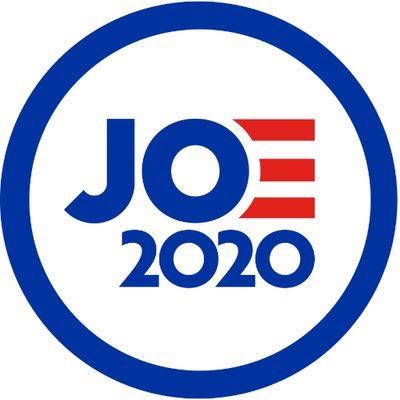
Joe Biden's 2020 Presidential Campaign Logo
Confirmed 17,396
Part of a series on Joe Biden. [View Related Entries]
Joe Biden's 2020 Presidential Campaign Logo
Part of a series on Joe Biden. [View Related Entries]
| Navigation |
| About • Origin • Spread • Various Examples • Search Interest • External References • Recent Images |
About
Joe Biden's 2020 Presidential Campaign Logo refers to the graphic released by Joe Biden for his 2020 Presidential Campaign. The logo features the letters J and O in blue, followed by three red striped meant to represent the letter E, spelling "Joe." However, social media users mocked the logo for looking as though it was promoting a candidate named "Jo," as well as its general design.
Origin
On April 25th, 2019, Joe Biden announced his campaign for the presidency in the 2020 election.[1] Among his announcement materials was a logo featuring the letters J and O in blue, followed by three red striped meant to represent the letter E, spelling "Joe" (shown below).

Spread
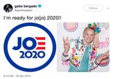
Twitter users joked about the logo by saying it looked like it was advertising a campaign for someone named Jo. For example, Twitter user @ChrisGeidner[2] joked by imagining it was for the character Jo from the sitcom The Facts of Life (shown below, left). Twitter user @gabebergado joked that it was for YouTuber JoJo Siwa (shown below, right).


Others mocked the design itself. User @erikhinton[2] tweeted it was a "tragedy," pointing out what he saw as several graphic design flaws (shown below, left). In a thread discussing how the logo was similar to Obama's, sser @isaacmbutters[3] tweeted a parody that added lots of elements of Obama's logo to Biden (shown below, right). Jokes about the logo were covered by Yahoo[1] and Daily Intelligencer.[4]


Various Examples


Search Interest
External References
[1] Yahoo – Joe Biden's 2020 presidential campaign logo gets mocked
[2] Twitter – ErikHinton
[3] Twitter – @isaacmbutters
[4] Daily Intelligencer – All of the Problems With Joe Biden’s Logo, According to the Haters
Recent Videos
There are no videos currently available.
Recent Images 12 total
Share Pin
Related Entries 78 total
Recent Images 12 total
Recent Videos 0 total
There are no recent videos.


Comments ( 13 )
Sorry, but you must activate your account to post a comment.
Please check your email for your activation code.