Electoral College Map Parodies
Part of a series on Politics / Government. [View Related Entries]
This submission is currently being researched & evaluated!
You can help confirm this entry by contributing facts, media, and other evidence of notability and mutation.
About
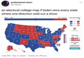
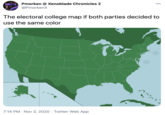
Electoral College Map Parodies are humorous edits to the map of the United States used in presidential elections to project and see which state will vote for which candidate.
Background
The Electoral College started after the creation of the United States of America in the late 1700s as a way for individual states to have importance in presidential elections beyond the popular vote.[1] The popular map of the electoral college features states colored in to reflect the party the state voted for (i.e., blue for Democrat, red for Republican), and has been a staple of American politics since the first presidential election held in 1789.[2]

Origin
The origins of electoral college map parodies and edits can be traced to the 2004 election, when demotivational posters and image macros used maps of the electoral college to mock Jesusland, a term used to mock Middle America which at the time voted with strong conservative and Christian beliefs.


Spread
As technology improved, cable news networks began incorporating interactive electoral college maps to their coverage, which prompted a Saturday Night Live sketch in 2008.[3] Still for the next two elections, electoral college map edits were not incredibly popular beyond some political cartoons and applications to preexisting memes like Scumbag Steve.

On November 3rd, 2014, Funny or Die[4] posted a collection of surreal Electoral College map edits in one of the more notable collections of Electoral College map edits.

In 2016, many media outlets[5][6][7] covering the election included an interactive map, which allowed users to see how the map would look if states voted certain ways, which in turn created the opportunity to make funny images, like a play on CADbortion/Loss, shown below.

"What the Electoral College Map Would Look Like" Edits
On October 11th, 2016, American statistician and writer Nate Silver of FiveThirtyEight.com published two pictures of the United States electoral map, one showing what it would look like if only men voted in the 2016 United States Presidential Election, the other showing what it would look like if only women voted.[8] The “only-men” map projected that Republican presidential nominee Donald Trump would win the 2016 Presidential Election handily, while the “only-women” map projected a landslide win for Democratic nominee Hillary Clinton. The tweets, shown below, have gained over 29,000 retweets combined as of October 13th, 2016.[9]


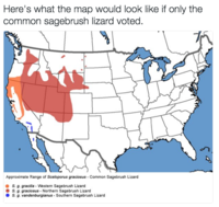
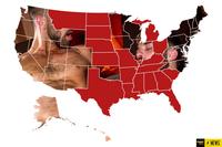
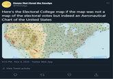
Their popularity and the related #repealthe19th controversy led to an October 12th surge of edits and jokes on Twitter where users posted pictures of the country edited to fit "What the United States Would Look Like if Only X Voted."


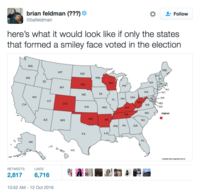
The popularity of the jokes gained media attention from New York Magazine,[10] The Hill,[11] and Wired.[12]
Various Examples



Search Interest
External References
[1] Wikipedia – Electoral College
[2] 270towin – Historical Presidential Elections
[3] Interactive Multimedia Technology – Multi-touch Parody of CNN's Magic Map Wall: Saturday Night Live's Weekend Update MegaPixel Giant Touch-map
[4] Funny or Die – 10 Maps that Explain the Midterm Elections
[5] 270towin – 2016 Presidential Election Map
[6] CNN – road to 270
[7] Real Clear Politics – Battle for White House
[8] FiveThirtyEight – Election Update: Women Are Defeating Donald Trump
[9] Twitter – @NateSilver538
[10] New York Magazine – Here’s What the Electoral Map Would Look Like If We Wrote a Meme Explainer About It
[11] The Hill – Parodies of 538’s gender-divided electoral maps flood Twitter
[12] Wired – How the Electoral Map Would Look: Women, Men … Bears?
Recent Videos
There are no videos currently available.







Top Comments
Yinzer
Oct 13, 2016 at 07:52PM EDT
Nedhitis
Oct 13, 2016 at 05:23PM EDT