Firefox Minimalist Logo
Part of a series on Mozilla Firefox. [View Related Entries]
[View Related Sub-entries]
About
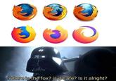
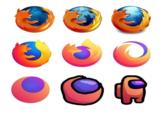
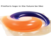
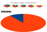
Firefox Minimalist Logo refers to a series of parodies mocking a new logo for the web browser Firefox released in February 2021, which used a more minimalist design then previous iterations that featured a cartoon fox encircling the globe.
Origin
Firefox has been tweaking the original design of its logo, that of a fox encircling a globe, every few years since its inception in 2004.[1] The design has gradually gotten less detailed over time. On July 13th, 2017, YouTuber Riswan Hanafyah Harahap posted a video documenting the progression of the logo to that point (shown below).
In July of 2018, Firefox polled its users[3] about what their logo should look like in the future. One of the options included a stylized set of logos for all Firefox products, including a logo with no globe and an orange swirl to represent the Firefox brand (shown below).

In July of 2019, the company began to introduce its most radical logo change to date, turning the browser's logo into a cartoon fox over a small purple circle[2] (shown below) and introducing the orange swoop to represent the Firefox brand of products.

Spread
Memes and widespread backlash to the logo did not begin until February of 2021. While the logo had been in use for over 18 months, a February 20th post by Twitter[7] user @very_real_Luigi erroneously claiming the Firefox brand logo was the current Firefox browser logo gained over 77,000 retweets and 562,000 likes (shown below).

From there, posts about the erroneously perceived "death" of the Firefox fox began to spread on social media. A February 22nd tier list post ranking Firefox logos by Redditor TheGoldenDeer_ in /r/dankmemes[4] appears to have launched the wave of backlash on Reddit. The post gained over 23,000 points (shown below).

After that post, Reddit experienced a surge in memes parodying and criticizing the Firefox logo. One of the most popular related posts was a detailed redraw of the logo posted by Redditor VishVasantth in /r/memes,[5] gaining over 121,000 points (shown below, left). User DagorCroc posted a This Is Brilliant But I Like This comparing the Firefox logo to a fan edit with Doge, gaining over 9,000 points in /r/dankmemes[6] (shown below, right).


Various Examples


Search Interest
External References
[1] Logaster – Firefox Logo
[2] Cnet – Firefox's new stylized logo is starting to arrive.
[3] The Verge – Firefox is getting a new logo, and Mozilla wants to hear what users think
[4] Reddit – /r/dankmemes
[6] Reddit – /r/dankmemes
[7] Twitter – very_real_Luigi


Top Comments
tman105
Feb 23, 2021 at 05:37PM EST
SirKeksalot
Feb 23, 2021 at 03:17PM EST in reply to