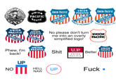
Oversimplified Logo
Confirmed 44,300
Part of a series on Firefox Minimalist Logo. [View Related Entries]
Oversimplified Logo
Part of a series on Firefox Minimalist Logo. [View Related Entries]
[View Related Sub-entries]
| Navigation |
| About • Origin • Spread • Various Examples • Search Interest • External References • Recent Images • Recent Videos |
About
Oversimplified Logo refers to a series of parodies that depict popular brand logos with a more minimalist design. The parodies began in February of 2021 in the wake of jokes about Firefox's Minimalist Logo and often take the form of Don't turn me into… videos.
Origin
In late February of 2021, memers began to joke about the development of Firefox's logo, which had been growing progressively less detailed since 2004. This lead to a misconception that the Firefox brand logo, which is a single orange swoop, was the new browser icon for Firefox, which is a cartoon orange fox encircling a globe. This idea was popularized by a February 20th tweet by @very_real_Luigi,[1] who claimed Firefox "killed the fox."

On February 22nd, YouTuber Memeify posted a video titled "Please Don't Turn Me Into An Oversimplified Logo" starring the Firefox logo. The video gained over 1.8 million views (shown below).
Spread
The Memeify video inspired a swath of similar videos featuring other logos. On February 26th, YouTuber CockRoach69 made a similar video using the logo for Google Chrome, gaining over 236,000 views (shown below, left). On February 24th, YouTuber Arcade Assassin made a similar video with the logo for Internet Explorer, gaining over 530,000 views (shown below, right).
Other popular videos in the trend include a second Arcade Assassin video, this time about the Pringles logo, gaining over 409,000 views (shown below, left) and a video by PepePeepo about the Discord logo, gaining over 210,000 views (shown below, right).
Various Examples
Search Interest
External References
[1] Twitter – @very_real_Luigi


Comments ( 11 )
Sorry, but you must activate your account to post a comment.
Please check your email for your activation code.