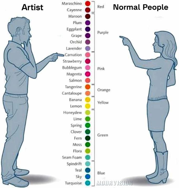
Artist vs. Normal People
Part of a series on Exploitables. [View Related Entries]
About
"Artist vs Normal Person" is a chart that depicts the difference between the names of colors between people who are artists and those that are not. It is frequently used to highlight the differences between people with knowledge of a certain subject, and those without said knowledge. People without knowledge are often seen as a Normies by people with this knowledge.
Origin
The image was first posted in March 2011 as part of an Inforgraphic Dump from the marketing blog Kissmetrics Blog.[1] There the image was used to show the general different perceptions of color between males and females.

Spread
The first notable derivative of the image was posted on Facebook group page of MOURViSiON on June 25th 2014[2]. The image has the individuals in the original picture swapped and with a caption at the top labeling the male on the left as an "artist" and female on the right as a "normal people". In the three years since it was uploaded, this post gained over 17,000 likes and 28,000 shares.

Search Interest
External References
[1] Kissmetrics Blog – True Colors – Breakdown of Color Preferences by Gender
[2] Facebook- MOURViSiON – Gallery
Recent Videos
There are no videos currently available.


Top Comments
lolwtfamidoinghere
Jan 21, 2017 at 05:53AM EST
Jack the Dipper
Jan 20, 2017 at 07:40PM EST