Relative Map Sizes / How Big Africa Really Is
Submission 4,844
Part of a series on Parody / Spoof. [View Related Entries]
Relative Map Sizes / How Big Africa Really Is
Part of a series on Parody / Spoof. [View Related Entries]
This submission is currently being researched & evaluated!
You can help confirm this entry by contributing facts, media, and other evidence of notability and mutation.
| Navigation |
| About • Origin • Spread • Various Examples • Search Interest • External References • Recent Images |
About
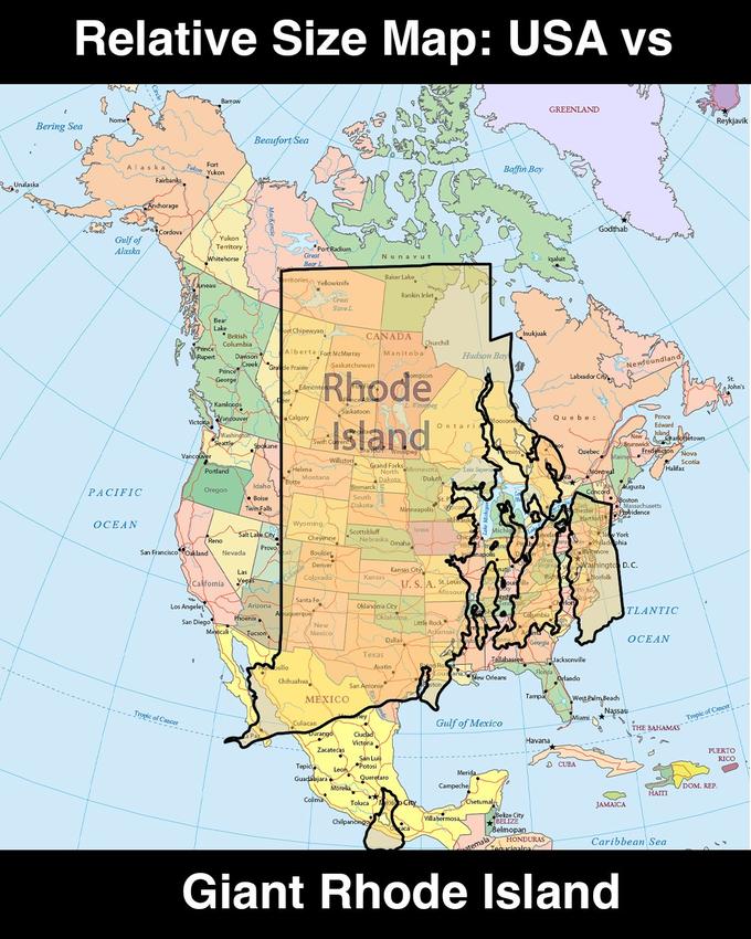
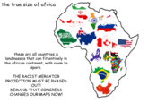
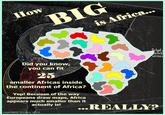
Relative Map Sizes, best known for the How Big Africa Really Is and How Big Texas Really Is versions, are a series of memes parodying infographics that showcase the true size of Africa, Texas and other territories located closer to the equator on Mercator projection maps.
Origin
The misconception about the true sizes of territories lying close to the equator stems from Mercator projection maps being the most widespread type of map.[1] The map inflates the size of objects further from the equator, resulting in territories lying close to it, such as Africa and Texas, being perceived as smaller than they actually are.
While similar maps have reportedly been created before, the first map comparing Africa's size to other parts of the world by projecting them onto its territory was created by German graphic user interface designer Kai Krause prior to October 13th, 2010.[2] Krause originally designed his first version of the map in the mid-1980s. The map showcased the true size of Africa, with the continent's territory being large enough to fit in the entirety of the U.S., all of China, India, Japan and most parts of Europe combined.


The map was widely shared online in the following years, with both reports by traditional media[3][4] and shares on Reddit and other social media.[5][6]
In the following years, more similar maps were created both by researchers. For example, on October 20th, 2012, The Economist[7] created a map comparing the size of Africa to that of other parts of the world (shown below, left). On June 16th, Scientific America[8] posted another version of the map (shown below, right). Both maps were then circulated on social media.[9][10]


On August 17th, 2015, the website The True Size[11] was launched, providing an interactive service for comparing sizes of countries and continents.
Spread
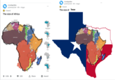
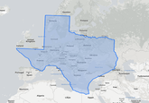
The earliest humorous discussion surrounding the "True Size" maps was ignited by Tumblr[12] user time-for-maps, who on October 4th, 2012, posted a map comparing the size of Texas to that of Europe. The post and the ensuing conversation accumulated over 1.4 million likes and reblogs in 10 years (shown below, left).On October 1st, 2014, Tumblr[13] user dietcrush posted the first parody meme that intentionally misrepresented the size of Texas compared to the United States. The post received over 102,900 likes and reblogs in eight years (post and reply shown below, right).


More parodies of the trope appeared starting in mid-2015. For example, on June 29th, 2015, Redditor BritneySprearsFuckedMe posted a map misrepresenting the size of the United States that gained over 3,600 upvotes in /r/MURICA[14] in six months (shown below, left). On June 30th, 2015, Redditor ericredbike, building off this post, posted a map misrepresenting the size of Texas that received over 240 upvotes in /r/LONESTAR[15] (shown below, right).


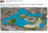
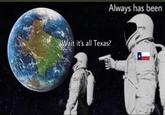
The trend continued in the second half of the 2010s with multiple parody maps posted to Reddit, Twitter, Instagram and other sites, with many posts going viral. For example, on August 9th, 2016, Twitter[16] user @xx_memedaddy_xx posted a Texas version of the meme that gained over 3,000 retweets and 4,700 likes in six years (shown below, left). A July 6th, 2019, parody post by an unknown Redditor gained over 930 upvotes in /r/mapporncirclejerk[17] (shown below, center). On January 4th, 2020, Instagram[18] meme page trashcanpaul posted a version that received over 40,800 likes in two years (shown below, right).


The parody trend saw continued prevalence online in the early 2020s.
Various Examples


Search Interest
External References
[1] Wikipedia – Mercator projection
[2] Kai Krause – The True Size of Africa
[3] Visual Capitalist – MISCMapped: Visualizing the True Size of Africa
[4] The Economist – The true true size of Africa
[5] Reddit – How big Africa really is [934×974]
[6] Reddit – The actual size of Africa.
[7] Internet Archive – Bulging in the middle
[8] Scientific American – Africa Is Way Bigger Than You Think
[9] Reddit – The sheer size of Africa
[10] Reddit – The real size of Africa.
[11] The True Size – Main page
[12] Tumblr – clotpolesonly
[14] Reddit – People don't realize how big America really is.
[15] Reddit – People don't realize how big TEXAS really is
[16] Twitter – @xx_memedaddy_xx
[17] Reddit – the TRUE size of africa
[18] Instagram – trashcanaul
Recent Videos
There are no videos currently available.
Recent Images 43 total
Share Pin
Related Entries 28 total
Recent Images 43 total
Recent Videos 0 total
There are no recent videos.




Comments ( 1 )
Sorry, but you must activate your account to post a comment.
Please check your email for your activation code.