Howdy! You must login or signup first!

Darkside

Submission   21,790

Part of a series on Album Cover Parodies. [View Related Entries]


About

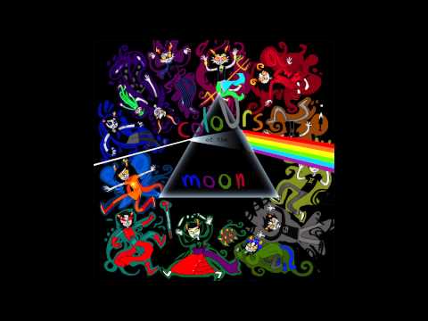
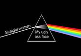
The Dark Side of the Moon Parodies refers to mock album covers based on the eighth studio album by the English progressive rock band Pink Floyd, released in March 1973. These parodies play on prism and rainbow design found on the cover of the record.

Origin

On March 1st, 1973, Pink Floyd released the album The Dark Side of the Moon.[1] The album's cover prism design (shown below) was inspired by a photograph that Thorgerson had seen during a brainstorming session with Powell. The artwork was created by their associate, George Hardie. Hipgnosis offered the band a choice of seven designs, but all four members agreed that the prism was by far the best. The design represents three elements; the band's stage lighting, the album lyrics, and Richard Wright's request for a "simple and bold" design. The spectrum of light continues through to the gatefold--an idea that Waters came up with. Added shortly afterwards, the gatefold design also includes a visual representation of the heartbeat sound used throughout the album, and the back of the album cover contains Thorgerson's suggestion of another prism recombining the spectrum of light, facilitating interesting layouts of the sleeve in record shops. The light band emanating from the prism on the album cover has six colors, missing indigo compared to the traditional division of the spectrum into red, orange, yellow, green, blue, indigo and violet.[2]

While cover parodies likely existed before, on Febraury 15th, 2000, the band the Squirrels released an album-length parody of the record entitled The Not-So-Bright Side of the Moon.[3] The album's cover featured the prism of light coming out of Squirrels-vocalist Rob Morgan's head.


Spread

On February 7th, 2006, the comedy music band Richard Cheese released a best of record entitled The Sunny Side of the Moon: The Best of Richard Cheese.[4] The album's covered parodied the Dark Side album cover by replacing the triangle with a martini glass (shown below, right).

Later that year, on September 19th, the Simpsons book The Krusty Book (Simpsons Library of Wisdom) was released.[5] In the book, a version of the album with the cartoon's character Krusty the Clown's head replacing the prism (shown below, center) and titling the record "Dark Side of the Moonpie."[6]

On April 25th, 2008, Flickr[7] user posted a parody replacing the prism with the Death Star space station from the 1977 science fiction film Star Wars. The post (shown below, right) received more than 1,000 views in ten years.

THE SUNNY SIDE OF THE MOON: THE BEST OF RICHARD CHEESE
Ai KRUSTY THE CLOWN DARE SIDE OF THE MOONPIE VW
PINK FLOYD DARK SIDE OF THE THAT'S NO MOON

Two years later, on February 21st, 2010, DeviantArt [8] user NES--still-the-best posted a version in which the prism is replaced by the "Tri Force from the fantasy video game The Legend of Zelda. Additionally, the character Link from the video game appear to be holding the image above his head. The post (shown below) received more than 22,000 views in eight years.

NES-still-the-best.deviantart.com Buonvino

In 2018, a series of object label variations on the cover came to prominence. On April 17th, 2018, Redditor [9] Ridnarht1 posted a version in the /r/dankmemes subreddit in which the beam is labeled "The frogs," the prism is labeled "chemicals in the water" and the rainbow implied to mean that the frogs are "turned gay," referencing the Alex Jones meme Gay Frogs Conspiracy. The post (shown below, left) received more than 36,000 points (91% upvoted) and 320 comments in two days.

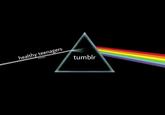
On April 18th, Redditor[10] Swagoala posted a verson in which the beam is labeled "healthy teenagers" and the prism is labeled "tumblr" in the /r/MemeEconomy subreddit. The post (shown below, left) received more than 1,000 points (94% upvoted) and 30 comments in 24 hours.

The frogs Chemicals in the water
healthy teenagers tumblr

Various examples:

THE TATAMIMATS THE DARK SIDE OF THE UKE

speek 2 mi peenk floid eeklips breethe n thu run tyme much munee anee kilurぜl eyke gr8 geg in thu skie breyn damnij uhs an thim

Search Interest

External References


Share Pin

Related Entries 6 total

Codymatherson-thumb
Make Your Own Album Cover
Fuckdapolicecomingwaitwrongsongshit
Straight Outta Somewhere / #S...
3skti
In the Aeroplane over the Sea
Outkast
Michael Cera Album Covers


Recent Images 86 total


Recent Videos 5 total


Load 14 Comments
"Dark Side of the Moon" Cover Parodies

"Dark Side of the Moon" Cover Parodies

Part of a series on Album Cover Parodies. [View Related Entries]

Updated May 25, 2020 at 08:14AM EDT by Y F.

Added Jul 16, 2011 at 08:05PM EDT by DarthLucario.

PROTIP: Press 'i' to view the image gallery, 'v' to view the video gallery, or 'r' to view a random entry.

This submission is currently being researched & evaluated!

You can help confirm this entry by contributing facts, media, and other evidence of notability and mutation.

About

The Dark Side of the Moon Parodies refers to mock album covers based on the eighth studio album by the English progressive rock band Pink Floyd, released in March 1973. These parodies play on prism and rainbow design found on the cover of the record.

Origin

On March 1st, 1973, Pink Floyd released the album The Dark Side of the Moon.[1] The album's cover prism design (shown below) was inspired by a photograph that Thorgerson had seen during a brainstorming session with Powell. The artwork was created by their associate, George Hardie. Hipgnosis offered the band a choice of seven designs, but all four members agreed that the prism was by far the best. The design represents three elements; the band's stage lighting, the album lyrics, and Richard Wright's request for a "simple and bold" design. The spectrum of light continues through to the gatefold--an idea that Waters came up with. Added shortly afterwards, the gatefold design also includes a visual representation of the heartbeat sound used throughout the album, and the back of the album cover contains Thorgerson's suggestion of another prism recombining the spectrum of light, facilitating interesting layouts of the sleeve in record shops. The light band emanating from the prism on the album cover has six colors, missing indigo compared to the traditional division of the spectrum into red, orange, yellow, green, blue, indigo and violet.[2]


While cover parodies likely existed before, on Febraury 15th, 2000, the band the Squirrels released an album-length parody of the record entitled The Not-So-Bright Side of the Moon.[3] The album's cover featured the prism of light coming out of Squirrels-vocalist Rob Morgan's head.


Spread

On February 7th, 2006, the comedy music band Richard Cheese released a best of record entitled The Sunny Side of the Moon: The Best of Richard Cheese.[4] The album's covered parodied the Dark Side album cover by replacing the triangle with a martini glass (shown below, right).

Later that year, on September 19th, the Simpsons book The Krusty Book (Simpsons Library of Wisdom) was released.[5] In the book, a version of the album with the cartoon's character Krusty the Clown's head replacing the prism (shown below, center) and titling the record "Dark Side of the Moonpie."[6]

On April 25th, 2008, Flickr[7] user posted a parody replacing the prism with the Death Star space station from the 1977 science fiction film Star Wars. The post (shown below, right) received more than 1,000 views in ten years.


THE SUNNY SIDE OF THE MOON: THE BEST OF RICHARD CHEESE Ai KRUSTY THE CLOWN DARE SIDE OF THE MOONPIE VW PINK FLOYD DARK SIDE OF THE THAT'S NO MOON

Two years later, on February 21st, 2010, DeviantArt [8] user NES--still-the-best posted a version in which the prism is replaced by the "Tri Force from the fantasy video game The Legend of Zelda. Additionally, the character Link from the video game appear to be holding the image above his head. The post (shown below) received more than 22,000 views in eight years.


NES-still-the-best.deviantart.com Buonvino

In 2018, a series of object label variations on the cover came to prominence. On April 17th, 2018, Redditor [9] Ridnarht1 posted a version in the /r/dankmemes subreddit in which the beam is labeled "The frogs," the prism is labeled "chemicals in the water" and the rainbow implied to mean that the frogs are "turned gay," referencing the Alex Jones meme Gay Frogs Conspiracy. The post (shown below, left) received more than 36,000 points (91% upvoted) and 320 comments in two days.

On April 18th, Redditor[10] Swagoala posted a verson in which the beam is labeled "healthy teenagers" and the prism is labeled "tumblr" in the /r/MemeEconomy subreddit. The post (shown below, left) received more than 1,000 points (94% upvoted) and 30 comments in 24 hours.


The frogs Chemicals in the water healthy teenagers tumblr

Various examples:


THE TATAMIMATS THE DARK SIDE OF THE UKE
speek 2 mi peenk floid eeklips breethe n thu run tyme much munee anee kilurぜl eyke gr8 geg in thu skie breyn damnij uhs an thim

Search Interest

External References

Recent Videos 5 total

Recent Images 86 total


Top Comment


+ Add a Comment

Comments (14)


Display Comments

Add a Comment