Tumblr Color Theory Children's Hospital Post
Confirmed 98,426
Part of a series on Tumblr. [View Related Entries]
Tumblr Color Theory Children's Hospital Post
Part of a series on Tumblr. [View Related Entries]
| Navigation |
| About • Origin • Spread • Various Examples • Search Interest • External References • Recent Images |
About
Tumblr Color Theory Children's Hospital Post is a viral reblog thread on Tumblr where a user claims that red, painted pathways on a hospital floor do not necessarily look like blood because, in color theory, red has more positive than negative connotations. The post was made in January 2019 and gained viral spread that year, inspiring memes where red painted and bloody floors are referenced as children's hospital floors.
Origin
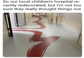
On January 18th, 2019, Tumblr[1] user memewhore posted an image macro showing a purported children's hospital with red painted pathways leading down the hallway and into the rooms (shown below). The caption reads, "So our local children's hospital recently redecorated, but I'm not too sure they really thought things out," implying the red paint looks like bloody trails. The post gained over 428,000 notes in three years.

Over the course of the month, users reblogged the post with additional text, creating a thread. On January 21st, Tumblr[2] user gildatheplant commented, "Literally any other colour would’ve been a better choice guys." That month, Tumblr user mintymaiden reblogged the post and commented (now deleted), "I’d like to point out that the colour red has more positive than negative meanings," along with a color theory chart showing the connotations of red according to color theory (shown below).

Tumblr user ichigo-hiyoko then responded:
red can mean whatever the heck you want it to mean, that is never going to change that this straight up looks like they DRAGGED A BLOODY BODY ACROSS THE FUCKING FLOOR.
Tumblr user youthful-pills commented by providing a link to the interaction-design.org[3] page on color theory in defense of mintymaiden, writing:
Hi fun fact, colors do have meaning and there is a legit thing called color theory. Red does has more positive connotations than negative like the @mintymaiden said. Red is associated with more love, lust, passion than blood and death just like the chart shows you but If you want, here’s a link for you to check it out yourself. Also, check out “The Designer’s Dictionary of Color” by Sean Adams. Have fun learning something.
On January 29th, Tumblr[4] user eternal-dannation commented, "this post is the perfect summation of tumblr’s reading comprehension and critical thought abilities" (post shown below, click to expand).

Spread
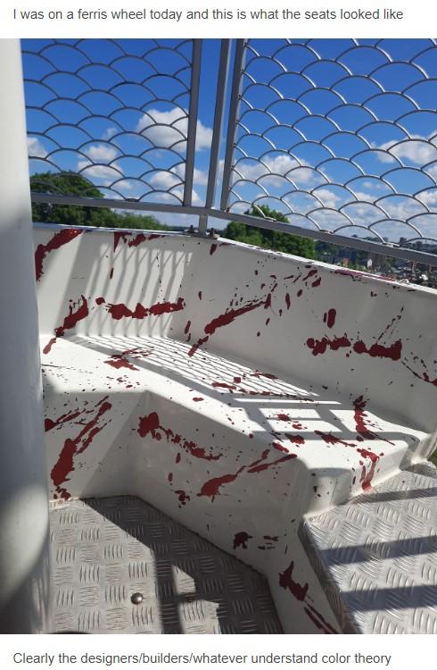
The post gained viral spread over the following years and inspired memes referencing it. On June 27th, 2020, Cheezburger[5] published an article about the post. On September 21st, 2021, Tumblr[6] user trustmeimanengiqueer posted an image of a water fountain dyed red to allegedly raise awareness about breast cancer, writing, "But this would be really good for a children’s hospital," gaining over 78,000 notes in 10 months (shown below).

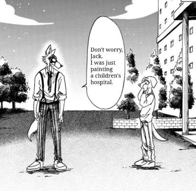
On September 25th, Tumblr[7] user ned-b posted a meme referencing the post, gaining over 115,000 notes in 10 months (shown below, left). On March 24th, 2022, Tumblr[8] user possumpunky posted an edit of the original hospital meme where the red is replaced with other colors, writing, "Do You Love The Colours Of The Children’s Hospital?" gaining over 67,500 notes in four months (shown below, left).

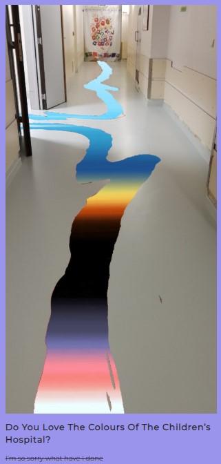
On July 24th, 2022, Redditor CharmQuark posted a version of the meme to /r/CuratedTumblr,[9] gaining over 4,100 upvotes in four days (shown below).

Various Examples




Search Interest
External References
[2] Tumblr – gildatheplant
[3] Interaction Design – Color Theory
[4] Tumblr – eternal-dannation
[5] Cheezburger – Tumblr Breaks Down Color Theory
[6] Tumblr – trustmeimanengiqueer
[8] Tumblr – possumpunky
[9] Reddit – CuratedTumblr
Recent Videos
There are no videos currently available.
Recent Images 12 total
Share Pin
Related Entries 103 total
Recent Images 12 total
Recent Videos 0 total
There are no recent videos.












Comments ( 12 )
Sorry, but you must activate your account to post a comment.
Please check your email for your activation code.