Namaste! You must login or signup first!

Iconsftw

Confirmed   83,138

Part of a series on Hashtag. [View Related Entries]


Following

About

#iconsftw is a Twitter hashtag that began trending shortly after Apple announced its latest version of popular digital media player application, iTunes 10. One of the more noticeable changes introduced with update is the revamped icon (shown above), which has been met by grievances from many users for its plain, ugly design.

Origin

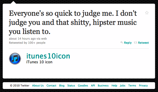
Within hours of announcement on September 1st, 2010, a twitter account called @itunes10icon was registered, vigorously defending itself from all the iTunes 10 haters via tweets.

Everyone's so quick to judge me. I don't judge you and that s-----, hipster music you listen to. about 14 hours ago via web Retweeted by 100+ people Reply Retweet itunes1Oicon iTunes 10 icon 2010 Twitter About Us Contact Blog Status Goodies API Business Help Jobs Terms Privacy

Spread

Within a few more hours, dozens more “Icon” accounts sprung up. To name a few: @iChaticon @windows7icon, @windows95 icon, @quicktime7icon, @mailicon, @itunes9icon, @FacebookIcon etc. All these new accounts strated doing something similar to @itunes10icon: defending themelves against haters while simultaneously declaring that they are, in fact, the best icon. Many of these icons/users have started putting the hashtag #iconsftw at the end of all their posts.

Development on Twitter

Twitter user @osxdude created a Twitter list encompassing all iconFTW accounts.

Apple CEO Responds

On September 3rd, Wired.com blogged a brief exchange between Apple CEO Steve Jobs and Joshua Kopac, a lead designer at the advertising firm ValuLeads who expressed his minor concerns over the iTunes10 icon via e-mail:

Kopac:

Steve, Enjoyed the presentation today. But…this new iTunes logo really sucks. You're taking 10+ years of instant product recognition and replacing it with an unknown. Let's both cross our fingers on this…

Steve Jobs then responded:

Jobs:

We disagree. Sent from my iPhone

User-Generated Icons for iTunes 10

Unsatisfied with the redesigned icon, some users began uploading their own alternative designs via Dribbble.


Share Pin

Related Entries 43 total

Not-intended-to-be-a-factual-statement
Not Intended To Be A Factual ...
Fml
#FML
Oomf_oomfie_slang_banner_image
Oomf / Oomfie
Pitbullzz
#PitBullDropOff


Recent Images 21 total


Recent Videos 1 total


Load 27 Comments
#iconsftw

#iconsftw

Part of a series on Hashtag. [View Related Entries]
PROTIP: Press 'i' to view the image gallery, 'v' to view the video gallery, or 'r' to view a random entry.


Following

About

#iconsftw is a Twitter hashtag that began trending shortly after Apple announced its latest version of popular digital media player application, iTunes 10. One of the more noticeable changes introduced with update is the revamped icon (shown above), which has been met by grievances from many users for its plain, ugly design.

Origin

Within hours of announcement on September 1st, 2010, a twitter account called @itunes10icon was registered, vigorously defending itself from all the iTunes 10 haters via tweets.

Everyone's so quick to judge me. I don't judge you and that s-----, hipster music you listen to. about 14 hours ago via web Retweeted by 100+ people Reply Retweet itunes1Oicon iTunes 10 icon 2010 Twitter About Us Contact Blog Status Goodies API Business Help Jobs Terms Privacy

Spread

Within a few more hours, dozens more “Icon” accounts sprung up. To name a few: @iChaticon @windows7icon, @windows95 icon, @quicktime7icon, @mailicon, @itunes9icon, @FacebookIcon etc. All these new accounts strated doing something similar to @itunes10icon: defending themelves against haters while simultaneously declaring that they are, in fact, the best icon. Many of these icons/users have started putting the hashtag #iconsftw at the end of all their posts.

Development on Twitter

Twitter user @osxdude created a Twitter list encompassing all iconFTW accounts.

Apple CEO Responds

On September 3rd, Wired.com blogged a brief exchange between Apple CEO Steve Jobs and Joshua Kopac, a lead designer at the advertising firm ValuLeads who expressed his minor concerns over the iTunes10 icon via e-mail:

Kopac:

Steve, Enjoyed the presentation today. But…this new iTunes logo really sucks. You're taking 10+ years of instant product recognition and replacing it with an unknown. Let's both cross our fingers on this…

Steve Jobs then responded:

Jobs:

We disagree. Sent from my iPhone

User-Generated Icons for iTunes 10

Unsatisfied with the redesigned icon, some users began uploading their own alternative designs via Dribbble.


Recent Videos 1 total

Recent Images 21 total


+ Add a Comment

Comments (27)


Display Comments

Add a Comment